Proactively establishing and growing a comprehensive design system for a corporate.
Navigation
1. Overview
Kaman Design System was the proactive initiative I built from the ground up to address the challenges our corporate faced in terms of inconsistency, poor branding, slow development process, and scalability.
Our design system is a live product that started with 5 essential elements and was grown to 12 comprehensive guidelines, including:
Colour System
Typography
Layout System
Icons
Brand
Design Patterns
Shared Vocabulary
Naming Conventions
Error Handling
Product Values
Design Principles
Data Visualization
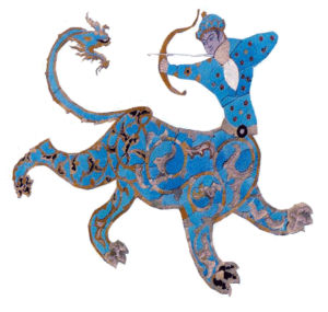
Kaman means bow in Farsi. The bow is a part of the Sagittarius constellation, which is the coat of arms of Isfahan - the city I come from.
2. Role & Context
I was a UX designer at a corporate with about 12 product teams. I was working in the largest product team with the following characteristics:
Product
An enterprise web application with a highly flexible and complex interface.
Role
Senior UX Designer
Team size
+20
Duration
2018-2021
Responsibilities
Identifying and fixing UI/UX issues
Designing new features
Redesigning the interface in long-term through refactoring
3. Problems
Working in this team for a couple of months, I noticed some problems. Here are the top 6:
Inconsistency
The lack of a unified design language led to inconsistencies in the design across user interface.
Slow Design Process
The design process was slow and impede development due to the lack of a standardised design system.
Poor Branding
The inconsistency in branding across products led to confusion and a lack of brand recognition.
Repetition & Time Waste
The need to repeatedly design similar solutions for different design tickets led to a waste of time and effort.
Dependent Design Process
The design process was heavily reliant on the designer, leading to delays personal preferences.
Lack of Required Components
The product interface was complex and required a wide range of components. The current component library was not covering the needs.
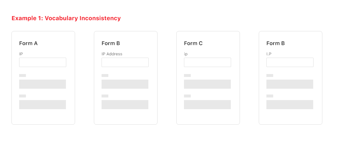
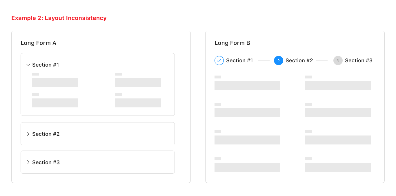
Below there are two real-life examples of inconsistency in our product. Due to the NDA, I have replaced the actual screenshots with imaginary ones.
An example of vocabulary inconsistency in forms.
An example of layout inconsistency in long forms.
No design system = Disconnected user experience
4. Goals
Next to identifying the problems is defining the right goals. We described the main objectives as follows:
Improving Consistency
Establishing a unified design language across products to create a consistent and cohesive user experience.
Increasing Development Speed
Speeding up the design and development process by providing a standardized set of design components and guidelines.
Improving Branding
Strengthening the company's branding by unifying the style of its products to create a strong brand identity and recognition.
Saving Time
Eliminating the need to repeat design solutions for different design tickets, reducing waste of time and effort.
Design Process Independence
Reducing dependency on people by providing guidelines and standards to enable independence and scalability.
Enriching Component Library
Providing a comprehensive set of design components to design for complex enterprise products.
5. Solution
Now, the question was: How might we go from problems to goals?
Although it is clear now that we need a design system to solve the problems mentioned, it was not so evident in 2018, as design systems were an emerging topic in UX.
To seek a solution, I researched well-known companies’ design departments to see how they tackled similar challenges. Through this investigation, I observed that these companies invest in design systems.
I started learning about design systems from the very beginning.
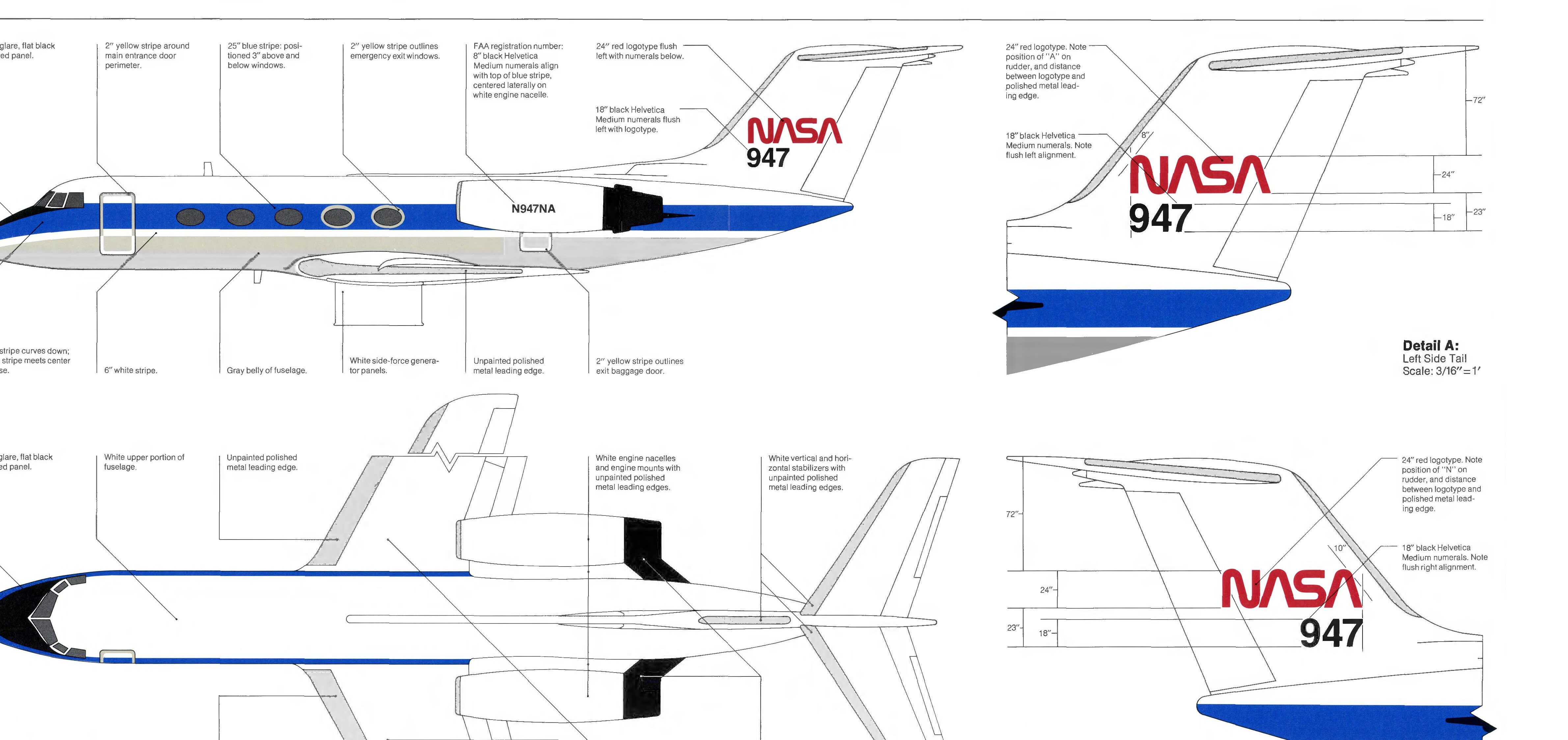
The first design system of history. Created in 1976 by NASA. Click to view.
6. Buy-in
Gaining buy-in is crucial for design system projects to ensure team members are committed to investing time and resources. A lack of support can impede the adoption of the system.
Establishing a design system would require an initial investment of time.
I conducted a persuasive presentation to the team.
Highlighting the numerous challenges we have and how a design system could address them.
We agreed to start small and extend the design system on demand.
My presentation to our team to get their buy-in. Click to view.
7. Learning
Educating myself on design systems before beginning the design process was crucial to creating a robust design system that could scale and effectively address our corporate’s needs.
It’s not about Figma; it’s a design language.
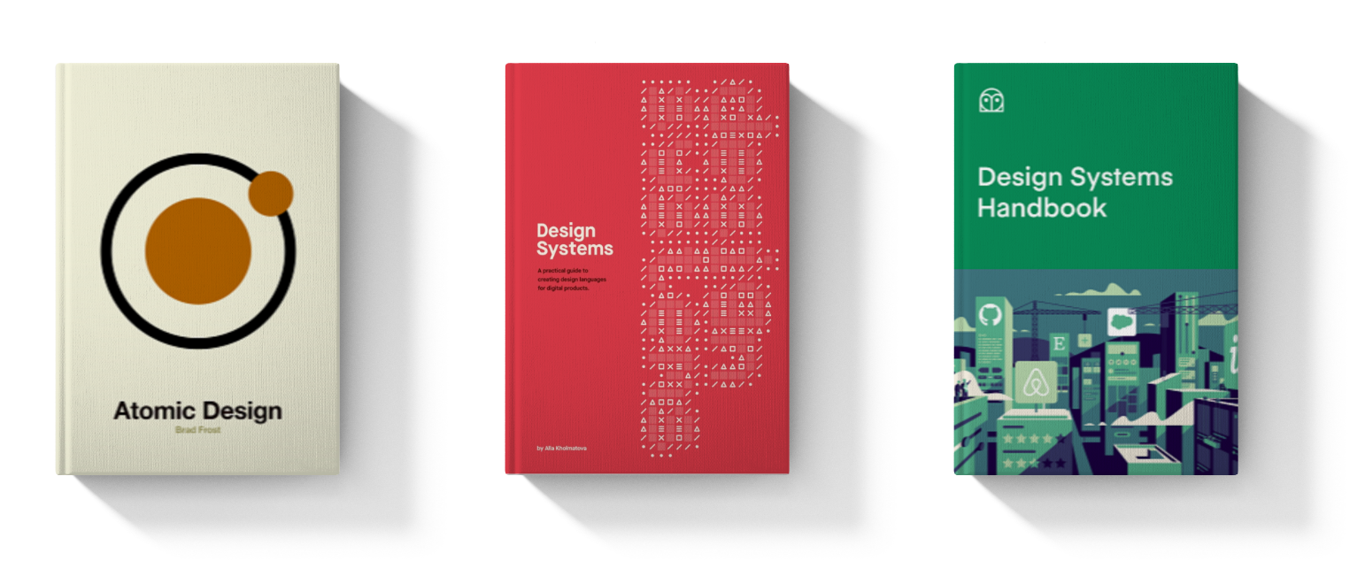
The books that I read to educate myself in the field.
Next was conducting thorough research on popular design systems to gain a better understanding of their structure and components.
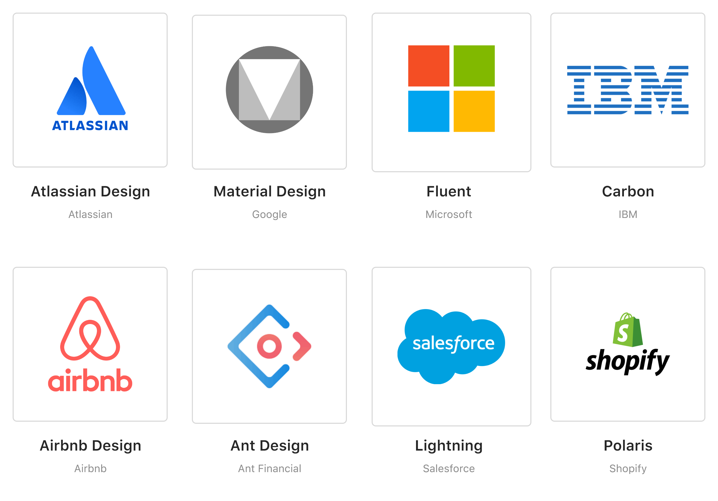
Popular design systems that I reviewed to gain insights.
8. Approach & Tools
It was now time to build the system. To create each guideline, I took this 3 step approach:
First step
Investigating the same guideline in other design systems.
Second step
Reviewing the books and other resources about that guideline.
Third step
Assessing the current and future needs of our products.
The following tools were used for designing, developing and documenting the design system:
Design
Originally designed in XD and then recreated in Figma.
Develop
Benchmarked the component libraries and chose the Ant Design. Used React to customise and extend it.
Documentation
Initially used Google Docs for convenience in edits and later tried Gitlab Wiki.
9. Outputs
The previous exercise resulted in the creation of a set of guidelines. Initially, five essential guidelines were developed and as the project progressed, the guidelines were extended to twelve.
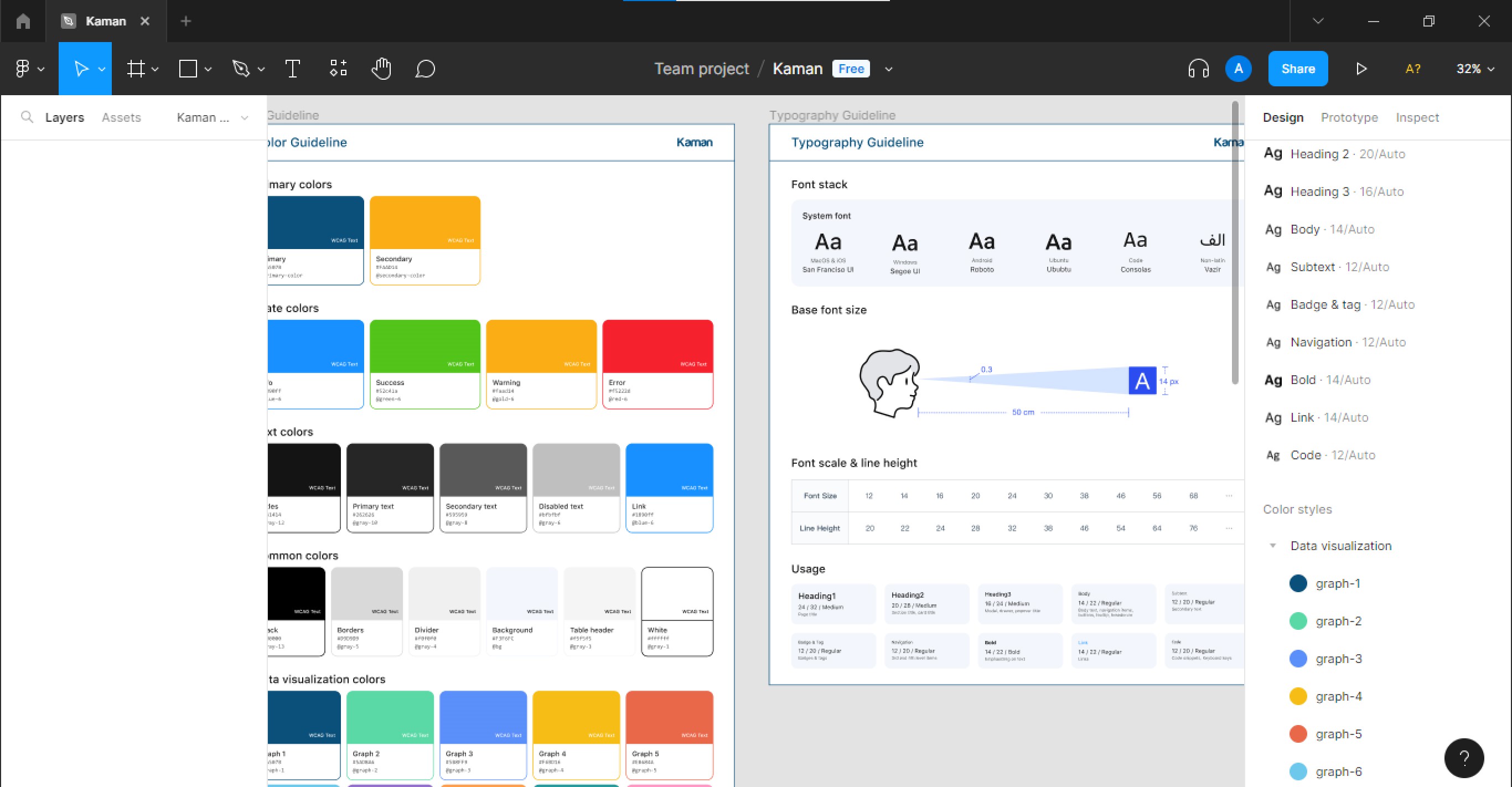
Non-disclosure AgreementKaman was designed using Adobe XD and is subject to a NDA. To provide a preview, a mini version was recreated using Figma.
Kaman design system created in Figma.
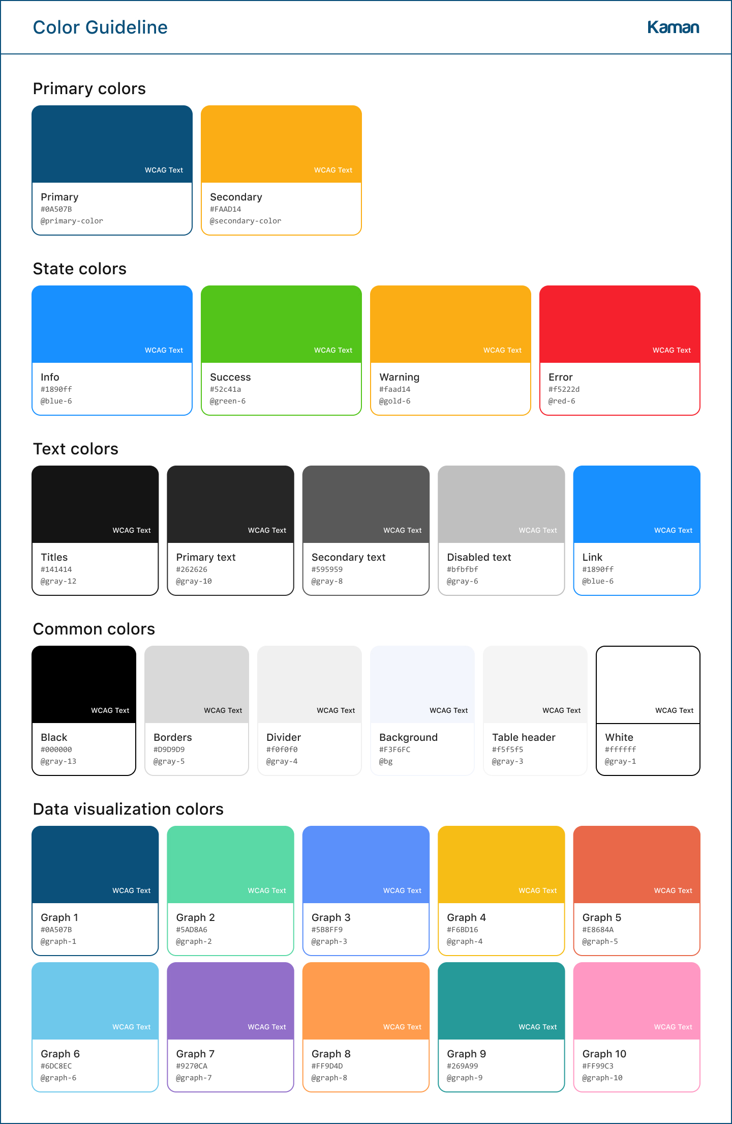
The colour system was developed to promote consistency and harmony across all company products. The colour palette was chosen based on extensive research on colour theory, colour psychology, and the company’s branding guidelines. Additionally, the colour system includes guidelines for WCAG, contrast ratios, and colour usage, ensuring that all products comply with accessibility standards and can be used by all users, including those with visual impairments.
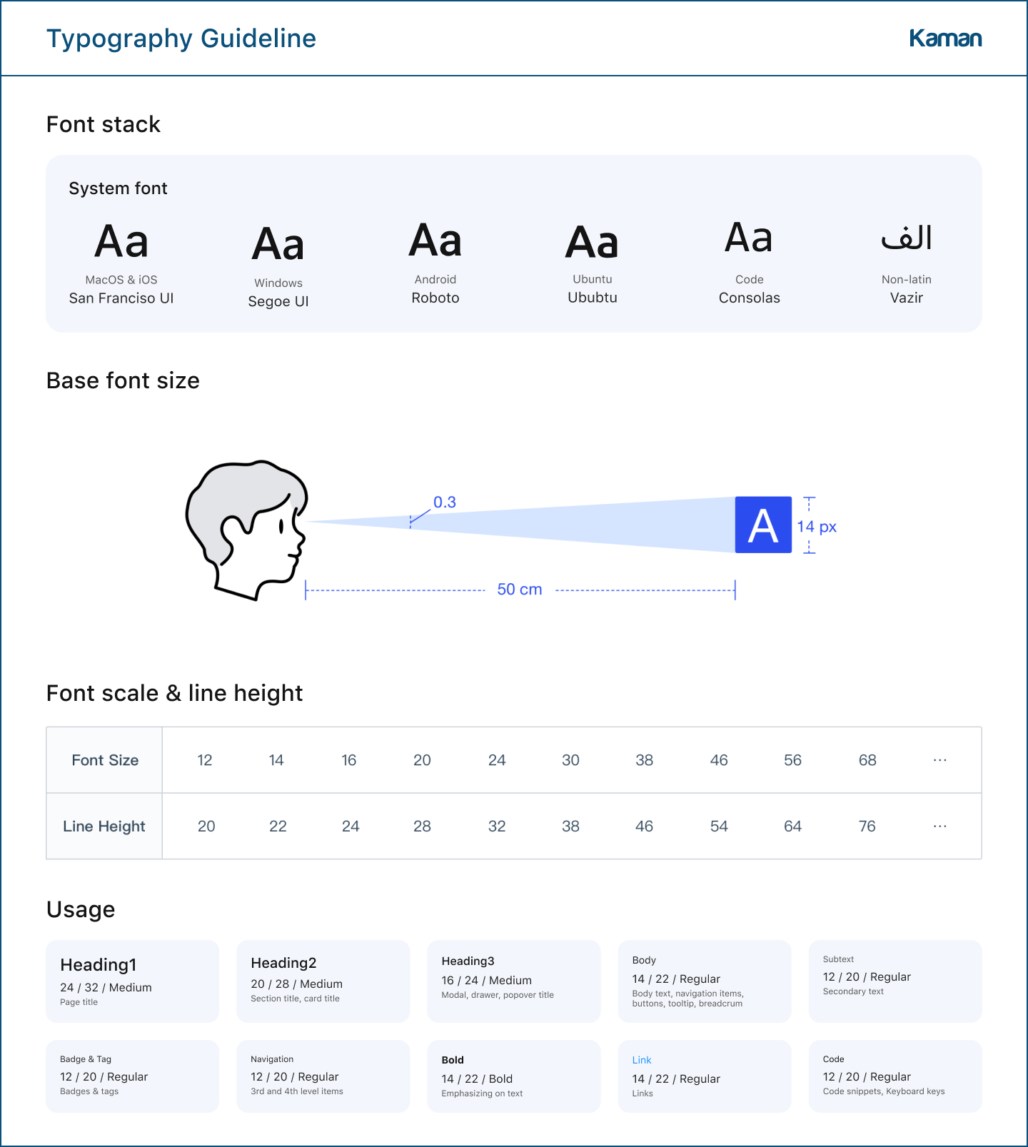
The typography standard consists of a set of fonts and sizes to be used consistently across all the company’s products. It includes guidelines on font pairings, line height, and letter spacing to ensure readability and consistency in the company’s visual identity. It supports multi-language products and is cross-platform.
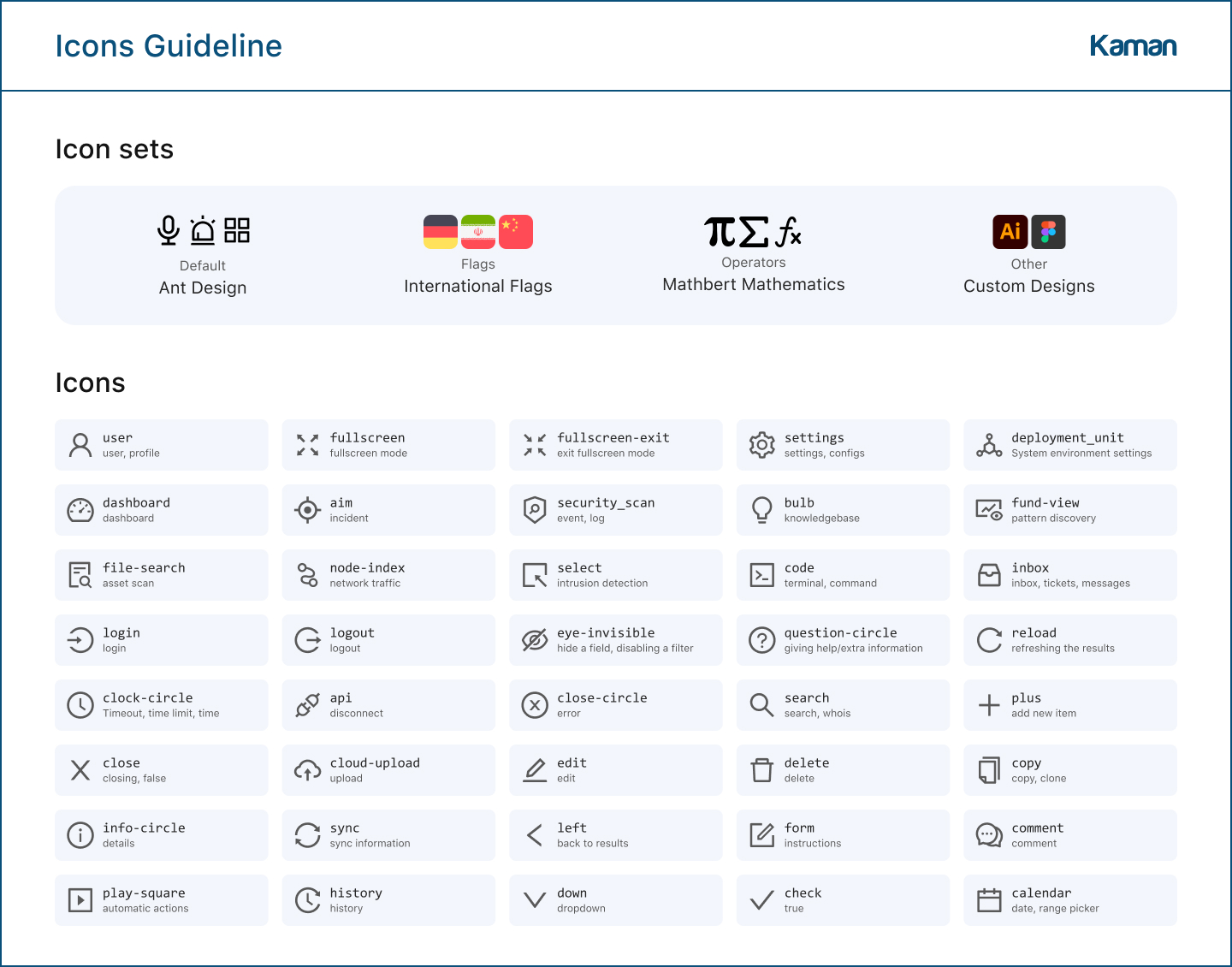
Kaman’s icon set follows a consistent style, ensuring clarity and ease of use. The set includes a range of icons covering a variety of functions and styles. The collection was carefully curated to ensure that every icon is clear, legible, and can be easily understood by users.
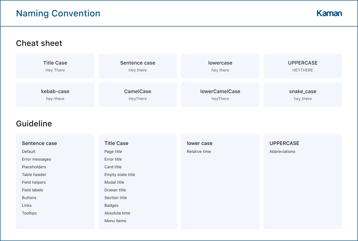
Hey you, Hey You, hey you, or HEY YOU? Inconsistency in naming in our UI was a problem. The standard was created by defining a straightforward syntax and rules for naming in UI, emphasising consistency and ease of use.
To cope with the complexity of the user interface, we needed a versatile component library. Since we lacked the resources to create one from scratch, we adopted one. We took Ant Design and customised and expanded it to meet our specific requirements.
10. Accessibility
Any design system is only useful if it’s accessible. We took action to make sure we’re aligned with accessibility guidelines like WCAG.
Colour Contrast
We prioritised pressure testing the colour systems of our brand to ensure sufficient contrast across various elements such as buttons, input fields, headers, and overall themes.
Keyboard Control
We created detailed specifications documenting how each component and interactive element would function with keyboard-only inputs.
Input Feedback
We prioritized transparency in our design system, ensuring that error and warning states provided clear information for users without confusing language.
Content Accessibility
We collaborated with content writers to provide alternative text and captions for all images and videos.
11. Evaluation
To assess the effectiveness of our design system, I began by reading a paper from DevBridge on the topic. From there, I developed a set of KPIs to evaluate the efficiency and adoption of the system. The KPIs were defined as follows:
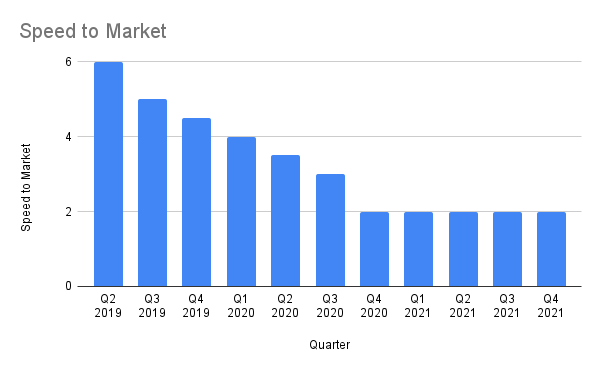
Speed to The Market
Efficiency / Quantitative
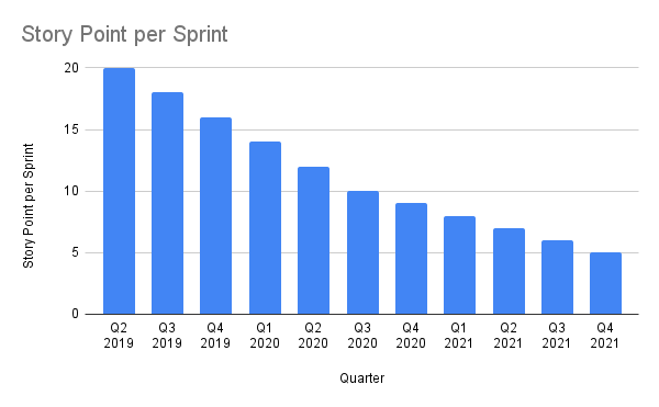
SP/sprint Designing New Components
Efficiency / Quantitative
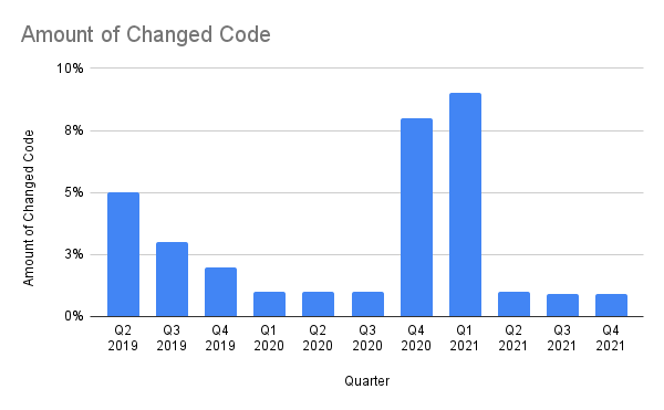
Lines of Code Developers Change with each Release
Efficiency / Quantitative
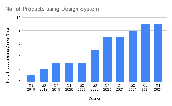
No. of Products using DS
Adoption / Quantitative
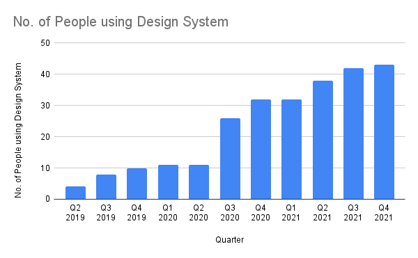
No. of People using DS
Adoption / Quantitative
Feedback from Users
Efficiency / Qualitative
I prepared a Google Sheets-based dashboard to monitor the KPIs every quarter, from Q2 2019 to Q4 2021 and shared the results with the entire company. The results were as follows:
12. Outcomes
Based on the evaluation mentioned above and other observations, Kaman brought us the following outcomes:
12.1. Business Outcomes
Reduced Time-to-Market
The availability of pre-designed components and standardized guidelines led to faster product releases.
Consistent Branding
Consistency across products enhances the brand's overall image, which was missing before this project.
Reduced Costs
Reduced design and development costs by avoiding duplication of work, saving both time and resources.
Increased Scalability
Increased scalability led to the ability to rapidly develop and launch new products, allowing the company to respond quickly to market demands.
12.2. User Outcomes
Streamlined Design and Development Processes
Enhanced productivity and efficiency for designers and developers, thanks to the availability of pre-designed components and guidelines.
Improved Collaboration and Communication
Improved collaboration among designers, developers, and product managers, leading to more effective communication and better coordination.
Easier Onboarding Process
The design system had a notable positive impact on our team's onboarding process, making it easier for both new hires and existing employees to get up to speed.
13. Challenges
Throughout the project, we encountered several challenges. Here, I will outline the top four challenges and then provide more details about one particular challenge and my approach to addressing it.
13.1. Top Challenges
Getting Buy-in & Educating
Getting buy-in from managers and team members, educating them on the importance of a design system, and encouraging the adoption of the new standards required extensive efforts.
Consistency vs Flexibility
Enforcing too much consistency restricts adoption while adding too much flexibility can affect the system's coherence.
Handling Exceptions
Determining how to handle exceptions that do not fit the standard guidelines was challenging.
Consistency vs Better Solution
There were instances where a better solution may compromise the consistency of the design system. Choosing between consistency and a better solution was challenging.
13.2. Consistency vs Flexibility
Enforcing too much consistency hinders adoption, while adding too much flexibility can affect the system’s coherence.
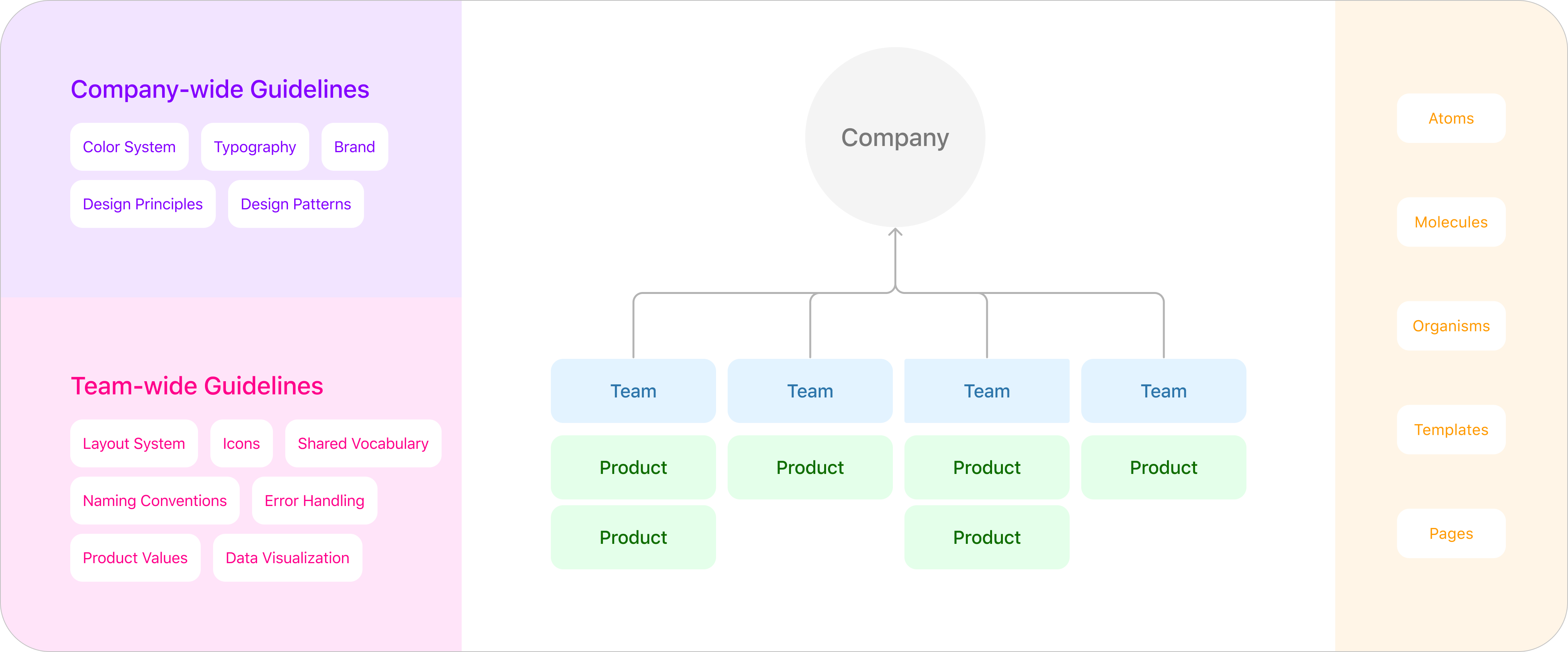
To strike the right balance, it’s crucial to consider the products adopting the design system, organization structure, and users. For instance, in our case, as most of our products were enterprise web apps, we required distinct components, icons, and spacing for each development but didn’t need to factor mobile design into our design system.
We established a hierarchical model to maintain coherency in the design system while allowing individual product teams the flexibility to adopt it based on their specific needs.
Our proposed hierarchical model to offer flexibility while keeping consistency.
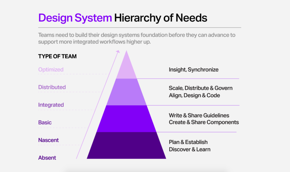
14. Maturity
We utilized Catriona Shedd’s maturity model to measure the progress of our design system, starting from “Absent” when there was no design system in place and progressing to “Distributed” during my tenure with the company. Our next steps for this design system are to sustain the Distributed phase and progress towards “Optimized”.
Design System Maturity Framework by Catriona Shedd. Click to view.


